Hi there,
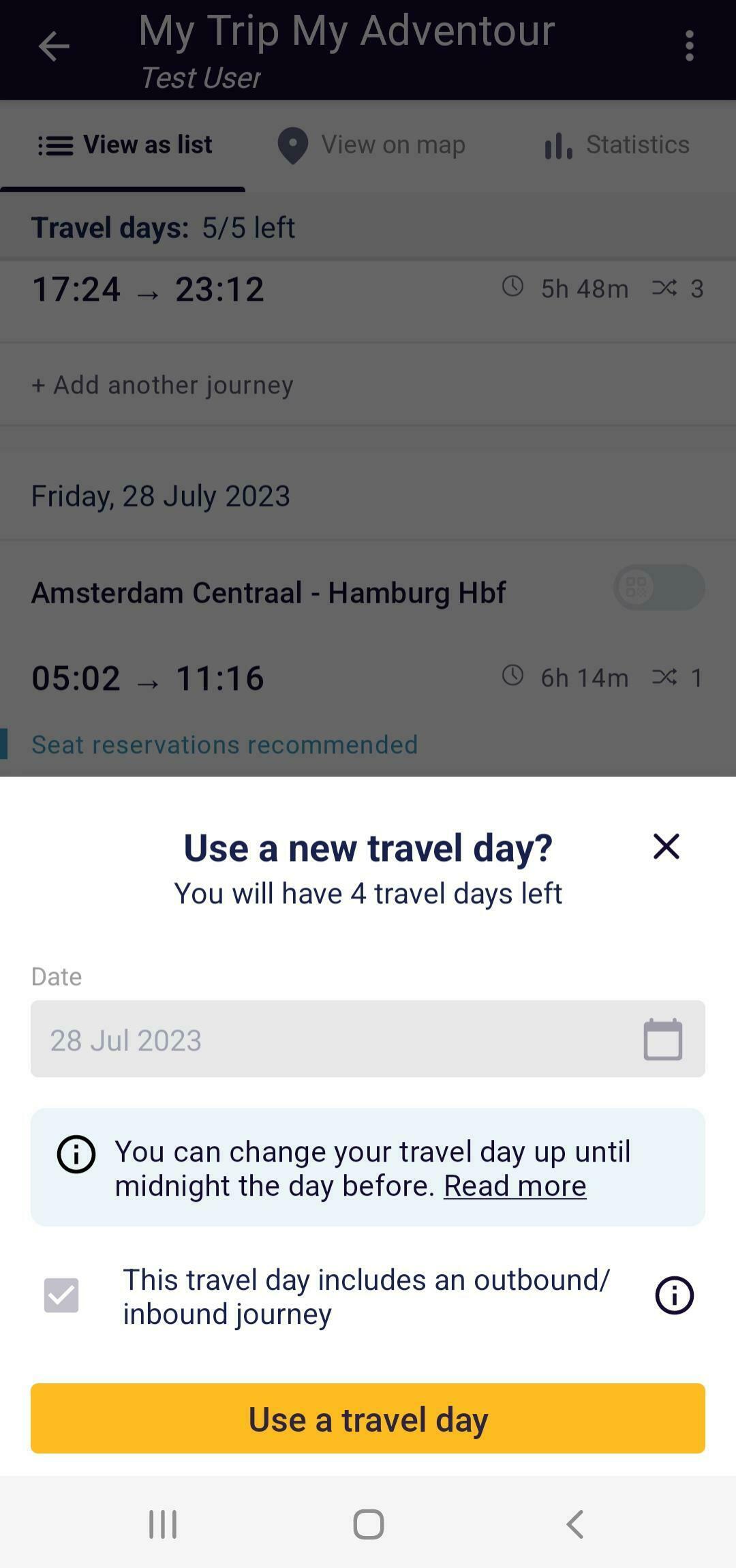
just a quick feedback for the great Rail Planner app since I found it confusing that travel days are shown next to outbound/inbound days used like this:

This may lead to people (at least me ;)) thinking that they have 7 travel days and in addition to that also one outbound and one inbound travel day. Of course, this clears up once you’ve added your first ticket, however I was confused at first and thought: yeah, that’s great, I must have missed this on the website that outbound/inbound travel days are on top (which they are not).
Possible solutions
- Maybe an info button next to the text “outbound/inbound” would do. It could explain what these days mean and that there are a subset of the travel days.
- Maybe another representation would be better, e.g. some nested layout, but I don’t really have an idea for that and it shouldn’t overcomplicate the layout.
- Maybe add the text: “… therefore” (of the 7 travel days)
All the best,
Dominic


